You crack a window. You hear birds. You step outside without a coat and think, “This is it. I’ve made it.” Meanwhile it is still February in the Midwest and we are absolutely one dramatic snowstorm away from humility.
And yet.
The sun is shining. The air feels hopeful. I am suddenly evaluating every wall in my house like it has personally disappointed me.
Because nothing says coping with seasonal confusion like randomly painting a room when you are bored.
If you, too, are hovering near a fan deck this week, allow me to gently encourage your chaos…
There is something about February warmth that convinces me I am a new person. A person who:
- Opens windows daily
- Reorganizes closets without resentment
- Starts seedlings responsibly
- Paints a bathroom on a Wednesday afternoon
It is seasonal optimism. It is unstable but it’s is productive.
And while I cannot guarantee spring is actually arriving, I can say with confidence that a fresh coat of paint will emotionally carry you through at least two more cold fronts.
So if you are like me and occasionally need to transform a room simply because the sun came out, here are ten spring-leaning paint colors that feel fresh without screaming “Easter at TJ Maxx”.
1. Benjamin Moore – Pale Oak
From Benjamin Moore, this warm greige whispers calm competence. Perfect for a bedroom refresh when you want subtle and safe but still different enough to justify the effort.

2. Farrow & Ball – Mizzle
A misty green gray from Farrow & Ball that feels like early morning light. Soft, slightly moody, and just English enough to make you feel thoughtful.

3. Farrow & Ball – Brinjal
This rich, inky plum is the perfect backdrop for the fresh greenery you will be hauling into your house in a few short weeks. It makes fiddle leaf figs look intentional. It makes simple branches in a vase feel dramatic. It is moody, grown up, and surprisingly spring-ready when paired with crisp whites and natural light.

4. Sherwin Williams – White Duck
From Sherwin-Williams, this is a creamy off white and would look perfectly dreamy paired with polished nickel hardware in a bathroom that may have you wondering, “Am I in a Nancy Meyers movie?!”

5. Farrow & Ball – Setting Plaster
A dusty blush that reads sophisticated, not nursery. If you have ever said, “I hate pink,” this is might be your exception.

6. Little Greene – Boringdon Green
This color is anything less than boring! A dusty green that may inspire me to read The Secret Garden again…

7. Sherwin Williams – Rookwood Terra Cotta
An incredibly cool deep orange that may have your house guests wondering, “Are they having a mental breakdown or are they on to something?” Leave them guessing. Go bold!

8. Farrow & Ball – Borrowed Light
A pale airy blue that actually feels like spring sky. Best applied on a day when it is 65 degrees and you are feeling bold.

9. Benjamin Moore – Cedar Path
From Benjamin Moore, this muted, earthy green feels like something you would paint your potting bench and then quietly thank yourself for in a couple of months when you are starting seeds and feeling deeply capable. It is grounded, calm, and just rustic enough without veering cottagecore cosplay.

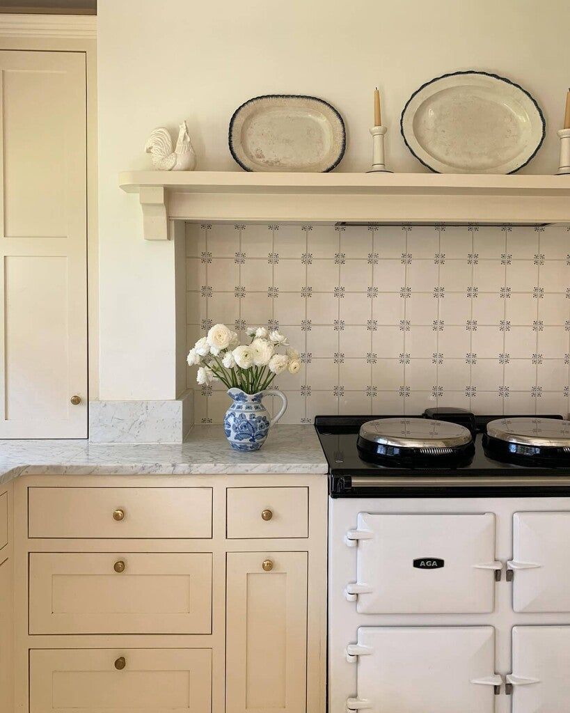
10. Farrow & Ball – Farrow’s Cream
This one deserves a moment. Farrow’s Cream is a buttery, gentle yellow that feels like sunlight on plaster. It is warm without being loud. It makes a kitchen cheery. It makes a hallway feel intentional. It makes February feel slightly less aggressive.

🚨 A Brief Moment of Responsibility!
Before you start taping off trim at 9 p.m., consider:
- Does the room have decent natural light
- Are you prepared to move furniture twice
- Have you fully recovered from your last paint project
If yes, proceed.
If no, you might still proceed. Just stretch first.
Leave a Reply